Email us
If you are finding the choice of web designs bewildering and are not sure where to start, this page gives you some initial guidance to help you choose a design or template that can function as the basis for your new website. To benefit from the current Handcrafted Websites design offer, we need to begin with an existing design, and the guidance on this page is intended to help you make that initial choice.
The selected design is merely the starting point. You can make your website unique with your own choice of colour scheme, background images/graphics, fonts and page layouts. In choosing a template you are choosing an approach to the layout of the site, not a specific colour scheme. If you are not sure about colours, etc., we will be glad to create a sample webpage with a suggested colour scheme for you to comment on and request alterations to (at no extra charge).
However, if you have seen something different elsewhere that you prefer, contact us, and we will let you know whether we can produce something along those lines within the same budget.
One basic design choice is whether or not to go for a boxed design. This is a design that puts all the content of the website in a visible box, which functions like a rectangular page area some distance in from the sides of the screen. Below is an example.

The above design puts a blurred photo behind the boxed area, but you could also have a plain color or a gradient.
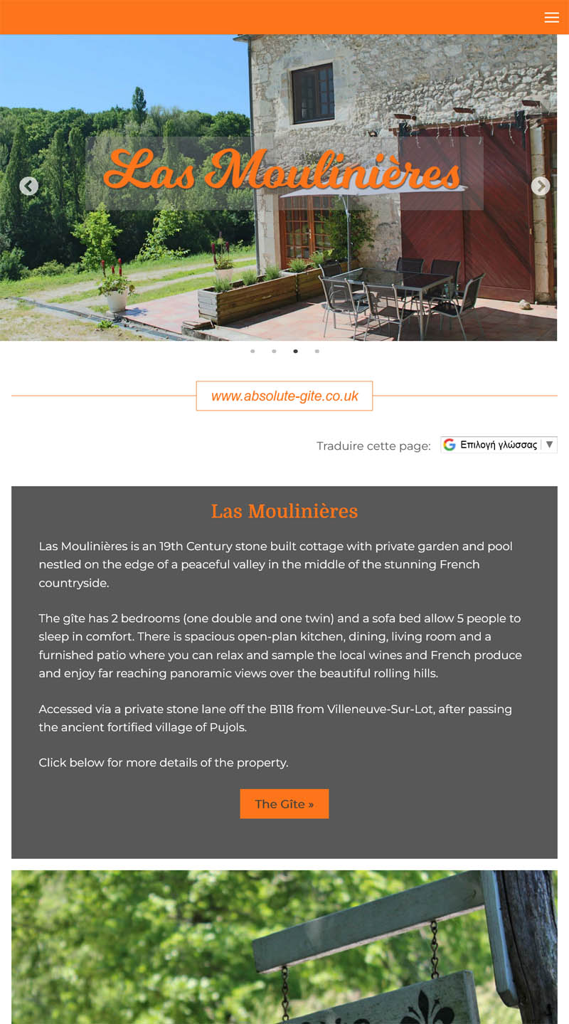
The alternative to a boxed design is a design that allows key areas of the website, like the header at the top, the footer at the bottom, and any banner photos or slide shows to fill the full width of the screen. An example:
Note that in the above design, lines of text are not stretched to the full width of the screen, but are kept to a limited width to improve legibility.
Another thing to consider is how to present your business name and where to put the main navigation for the website. These are usually the two most important components of the website header that is repeated throughout the website. Usually, the website navigation is a horizontal menu either at the very top of the header or beneath the business name. However, other arrangements are possible. One alternative is to put a small logo in the centre of a horizontal menu, and another is to show only a hamburger icon (three horiztontal lines) to reveal the navigation only after that icon is clicked. Here are screenshots of a few examples.


This isn't a choice any longer, but it requires a little explanation if you haven't come across this term before, and it is something to bear in mind when looking at designs. Responsive designs are so called because they respond to the width of the visitor's screen. In practice, what this means is that when you look at the same website on different-sized devices, you might see a different layout. One difference is that long, horizontal menus will be hidden on smaller screens, showing only the hamburger icon, which the visitor can click to see the menu. Another difference will be that content spread across multiple columns in a row on wider screens might be displayed in one long single column on narrower screens.
For instance, the website below has a column on the left at the top with a vertical navigation menu, and two columns below the slide show.
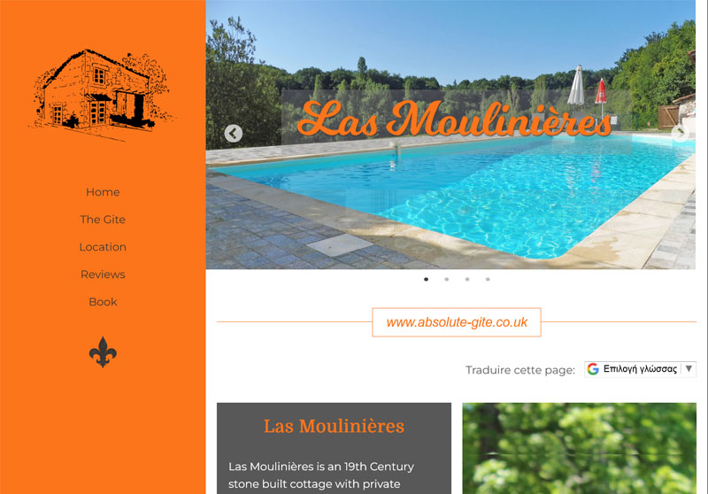
But on smaller devices, the left column with the navigation is hidden, a new band at the top appears with the hamburger icon, and the multiple columns further down align up vertically into one single column.
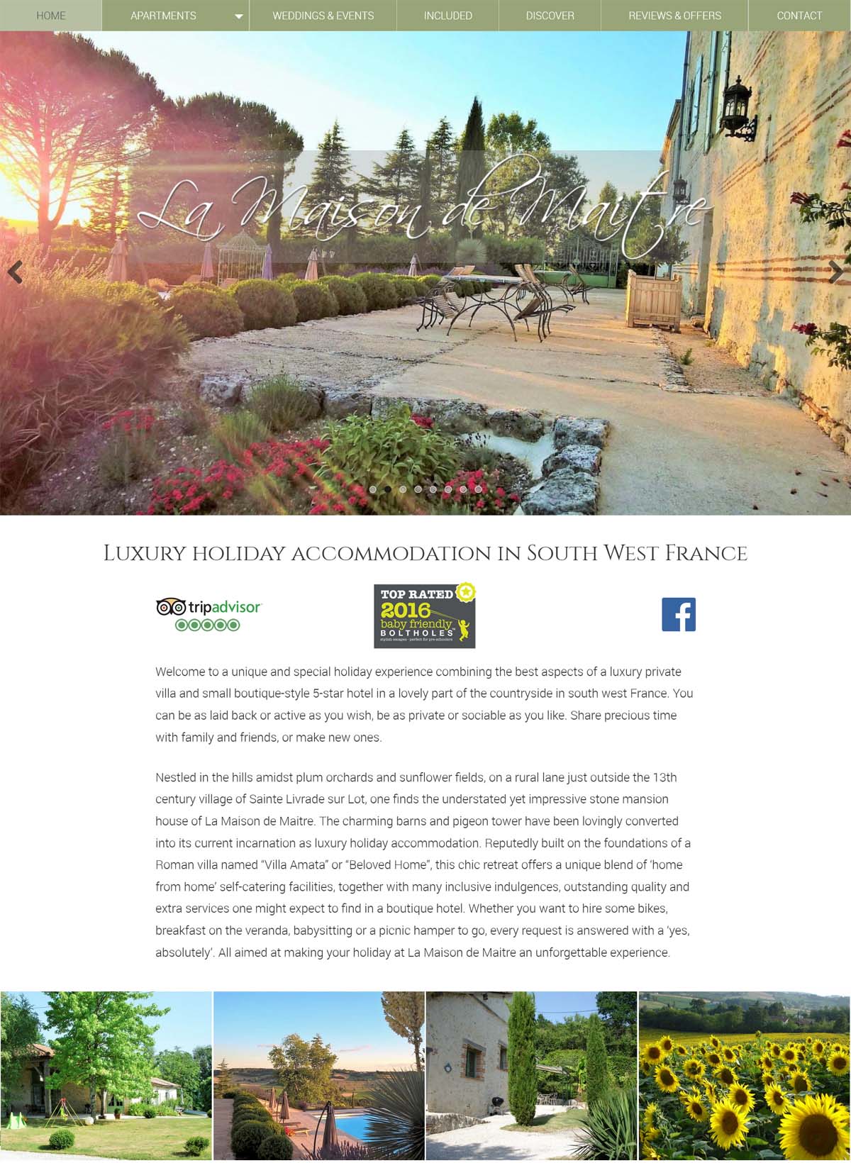
In some quarters there is an assumption that the content of a web page should fit onto the screen without scrolling. There are a number of arguments against this. One is that since the emergence of the social media, people have become accustomed to scrolling down infinitely long pages. Some argue that infants now learn to scroll before they can walk. The other argument is that to have a chance of doing well with the search engines, you need more textual content than you can fit on a scroll-free page. The more text, the better as far as search engine ranking is concerned. The owner of La Maison website agreed, and her home page is this long:

Hopefully, those few pointers will help you make a choice from among the existing designs.
To browse the full range of existing website designs, see our portfolio below.